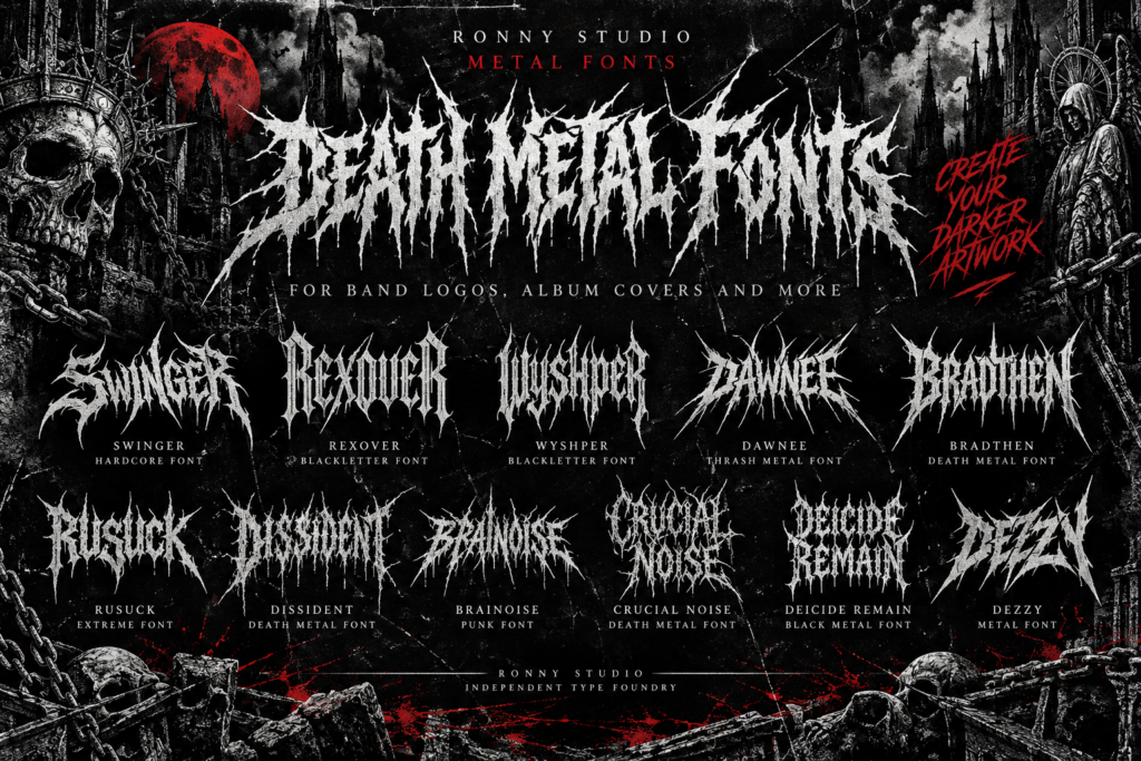
Death metal is more than a music genre. It has a visual identity built around aggressive lettering, dark imagery, distorted shapes, and powerful artwork. From underground band logos to album covers and concert posters, typography plays an important role in creating a recognizable metal aesthetic.
Choosing the right death metal font can help musicians, graphic designers, and independent artists create artwork that reflects the sound and personality of their projects.
If you are looking for the best death metal fonts for band logos and album covers, this guide explores what makes metal typography effective, how to choose the right style, and several typefaces from Ronny Studio worth exploring for your next design.
What Makes a Great Death Metal Font?
Death metal typography often pushes lettering beyond conventional design rules. Some fonts feature sharp edges and aggressive shapes, while others use distressed textures, dense letterforms, or dramatic blackletter influences.
The best choice depends on the visual direction of your project.
1. Aggressive Letterforms
Sharp terminals, angular shapes, and unconventional proportions can create an intense visual impression. These characteristics work particularly well for extreme metal artwork, where typography needs to communicate energy and attitude.
2. A Distinctive Visual Identity
A memorable band logo should look different from the logos of other bands. Choosing a distinctive typeface gives designers a starting point for developing a recognizable identity.
Custom spacing, letter combinations, and additional graphic elements can make the final design more personal.
3. Strong Contrast
Many metal designs use white lettering against black backgrounds or combine dark typography with dramatic illustrations. A font with a strong silhouette can help the text stand out in these compositions.
4. Readability at Different Sizes
Some extreme metal lettering is intentionally difficult to read. That approach can suit underground artwork, but it is not always practical for every application.
Consider where the design will appear. Album artwork may allow more experimental lettering, while event posters and promotional graphics often benefit from clearer text.
Best Death Metal Fonts to Explore from Ronny Studio
Ronny Studio develops display typefaces for designers who want distinctive typography for bold visual projects. The following fonts are worth exploring when building a death metal, hardcore, thrash metal, or underground music aesthetic.
Always check each font’s actual specimen and glyph shapes before choosing it for a specific project.
1. Deicide Remain — For Extreme Metal Artwork
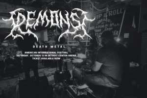
When developing artwork for an extreme metal project, typography should complement the intensity of the music without overwhelming the overall composition.
Deicide Remain is one of the Ronny Studio typefaces to explore for death metal-inspired designs. Consider testing it in band-logo concepts, album artwork, and dark promotional graphics.
Design idea: Create a monochrome album-cover concept with the band name as the main visual element. Keep supporting text smaller so the primary lettering remains dominant.
Explore the Ronny Studio Blackletter collection to discover available styles.
2. Crucial Noise — For Raw Underground Graphics
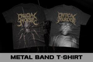
Underground music artwork often benefits from a raw, uncompromising visual direction. The right display font can help establish a strong hierarchy between the band name, album title, and supporting information.
Crucial Noise is another Ronny Studio typeface worth testing for extreme music graphics and bold typography experiments.
Design idea: Combine large lettering with a restrained black-and-white layout, distressed imagery, and minimal supporting text.
The goal is to create an intense visual identity without making every element compete for attention.
3. Bradthen — For Bold Metal Design Concepts
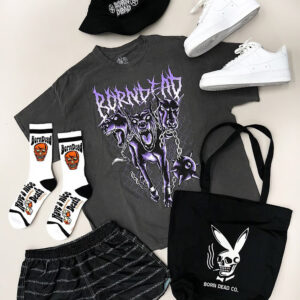
Bold typography can provide a strong foundation for album titles, promotional artwork, and headline-driven compositions.
Bradthen is worth considering when exploring a heavier display aesthetic. Test the actual letterforms at both large and small sizes before deciding how to use them.
Design idea: Build a simple album-cover mockup with the title positioned prominently, then introduce secondary graphics only where they improve the composition.
4. Rusuck — For Experimental Metal Typography
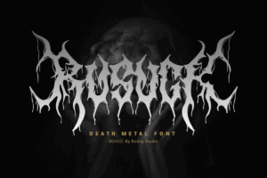
Metal design does not have to follow one visual formula. Some projects benefit from unusual letterforms and unconventional layouts rather than a predictable arrangement.
Explore Rusuck alongside other Ronny Studio display fonts to compare its character and determine whether it fits your project’s visual direction.
Design idea: Create three variations of the same fictional band logo, changing the typeface and composition while keeping the color palette consistent.
This makes it easier to evaluate which style communicates the strongest identity.
5. Dissident — For Dark Music Branding
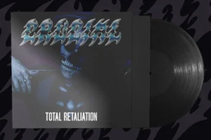
A dark visual identity can be developed through typography, contrast, spacing, and supporting artwork.
Dissident is another option to explore within the Ronny Studio range when developing metal-inspired branding concepts.
Try it in a series of logo studies before committing to a final design. The best result will depend on the actual letterforms, the band name, and the intended application.
6. Dawnee — For Thrash Metal-Inspired Artwork
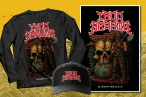
Thrash metal graphics often use energetic compositions, striking typography, and a strong sense of movement.
Dawnee is worth exploring for designers working across thrash-inspired artwork, music posters, and other bold display applications.
Design idea: Combine an expressive headline with a compact event-information section. Keep the supporting details readable even when the main typography is highly decorative.
7. Swinger — For Hardcore and Crossover Projects

Hardcore and crossover aesthetics can move between aggressive display lettering, compact compositions, and raw underground graphics.
Swinger is a Ronny Studio typeface to explore when comparing typography options for these projects.
Test it with short band names, large headlines, and alternative layouts to see how its letterforms work within your design.
8. Brainoise — For Punk and Underground Visuals
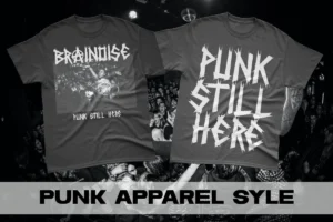
Punk and underground music graphics often prioritize attitude and individuality over conventional polish.
Brainoise can be included in your exploration of bold typography for independent music projects. Compare its appearance with other fonts in the collection to find a style that suits your artwork.
Design idea: Create a gig-poster concept with one dominant headline, a limited color palette, and clearly organized event information.
9. Dezzy — For Distinctive Display Experiments
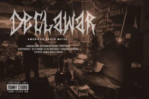
When developing a metal-inspired visual identity, experimenting with different display fonts can reveal unexpected creative directions.
Dezzy is another typeface from Ronny Studio to consider when comparing lettering styles for artwork, promotional graphics, and typography studies.
Evaluate its actual appearance in your preferred words rather than relying on a font name alone.
10. Rexover and Wyshper — Explore Blackletter-Inspired Directions
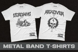
Blackletter typography offers a different route into dark and alternative visual design. Its historical letterforms can create a gothic character that contrasts with the more extreme shapes found in some metal logos.
Rexover and Wyshper are worth comparing within the Ronny Studio range when exploring blackletter-inspired designs.
Try both with the same fictional band name and compare their visual weight, spacing, and overall character.
Browse the Blackletter font collection to explore the available typefaces.
How to Choose the Right Metal Font for Your Band
Before purchasing a font, consider the intended use and the identity you want to create.
Match the Font to Your Music
Different styles of heavy music can benefit from different visual approaches.
These are creative starting points, not strict rules. The best typography is the one that fits your particular project.
Test Your Band Name Before Purchasing
A font can look impressive in a specimen but behave differently with your band’s name.
Before making a decision, check:
These checks can help prevent problems after purchase.
Create a Consistent Visual System
A strong metal identity includes more than a logo. Consider how the typography will work across album covers, digital artwork, posters, social media graphics, and promotional materials.
You can use a distinctive display font for major headlines and a simpler complementary font for track lists, event details, and other supporting information.
This approach creates visual contrast while keeping essential information readable.
Common Mistakes When Using Death Metal Fonts
Even a strong typeface can produce a weak design if it is used without considering the overall composition.
Using too many decorative fonts. One dominant display font and a complementary text style are often enough.
Ignoring readability. Highly experimental lettering can be effective for a logo, but important information such as event dates and venue details should remain easy to understand.
Choosing a font only because it looks extreme. The typeface should match the band’s personality and the intended audience.
Forgetting licensing requirements. A personal design project, a commercial release, and a client project may require different permissions depending on the font’s license.
Failing to test the actual wording. Always preview the exact band name or album title before finalizing your design.
Choosing the Right Font License for Your Project
Before using a font in a commercial project, review the applicable license carefully.
Consider whether you are designing for your own band, creating work for a client, producing promotional materials, or working on a larger commercial campaign.
Different licenses can impose different restrictions on usage, distribution, and client work. Do not assume that every font purchase includes unlimited commercial rights.
Read the Ronny Studio Font License and choose the license that matches your intended use. If your project falls outside the stated terms, contact the foundry for clarification before proceeding.
Explore Metal Typography from Ronny Studio
Finding the right font is an important step in creating a distinctive identity for a metal band or underground music project.
From death metal-inspired artwork to thrash metal posters, hardcore graphics, and blackletter designs, the right typeface can help bring your creative direction together.
Ronny Studio offers a range of display and blackletter typefaces worth exploring for your next design. Compare the actual font previews, test your wording, and choose a style that supports your project’s identity.
Ready to find your next metal font?
Explore the Ronny Studio Blackletter collection and discover a typeface for your next logo, album cover, or underground music artwork.
Frequently Asked Questions
What is the best font for a death metal band logo?
The best font depends on the band’s identity, name, and preferred visual style. Compare several typefaces using the actual band name before making a final decision.
Can I use death metal fonts for album covers?
A suitable display font can work well for album covers, provided its license permits the intended use. Check the font’s terms before publishing or distributing commercial artwork.
What is the difference between death metal and black metal fonts?
Death metal-inspired typography often emphasizes aggressive, dense, or distorted lettering, while black metal designs frequently explore darker, atmospheric, or blackletter-inspired approaches. These styles can overlap, and there is no single universal rule.
How do I choose a font for a metal band logo?
Start with the band’s genre and personality, test the actual name, review readability at different sizes, and confirm that the license covers your intended use.
Where can I find metal and blackletter fonts?
You can explore the Ronny Studio Blackletter collection for available typefaces and compare their previews before choosing a font.
Do I need a commercial license for a metal band logo?
That depends on the license terms and how the font will be used. Review the applicable license and confirm that it covers your specific project before using the font commercially.