
A great band logo should be instantly recognizable.
Whether you’re creating an identity for a metal band, punk band, hardcore group, rock project, or underground music act, typography plays a huge role in defining the band’s visual identity.
The right font can make a band look aggressive, dark, rebellious, energetic, mysterious, or experimental.
In this guide, we’ll explore the best fonts for band logos and how to choose the right typeface for your music project.
A band logo is more than just a name.
It becomes part of the band’s identity and appears across many different places, including:
A strong typeface helps your audience recognize the band even before they hear the music.
For underground and extreme music, typography can be especially important because the visual identity often needs to communicate the genre immediately.
Before choosing a font, consider these factors.
A band logo shouldn’t look generic.
The typeface should communicate something about the music.
For example:
Metal → dark, sharp, aggressive
Punk → rough, rebellious, chaotic
Hardcore → bold, powerful, underground
Rock → strong, energetic, expressive
Alternative → experimental and unconventional
Some band logos use extremely complicated lettering.
While this can look impressive, your audience should still be able to recognize the band’s name.
A good logo balances character and readability.
Your band logo may eventually appear on:
Therefore, the font needs to work across different sizes and applications.
The typography should feel connected to the music.
A futuristic sans serif might work perfectly for electronic music but feel completely wrong for an old-school death metal band.
Choose typography that supports the band’s sound and personality.
Here are some font styles to consider when creating a powerful band identity.
Blackletter is one of the most recognizable styles in heavy music and underground culture.
Its dramatic shapes make it especially effective for:
Blackletter can instantly give a logo a darker and more powerful personality.
Death metal typography is often extreme, chaotic, and highly detailed.
These fonts are designed to create an aggressive visual identity.
They work particularly well for:
Ronny Studio already has a collection of aggressive metal-oriented fonts suitable for band logos, album artwork, posters, and merchandise.
Hardcore typography needs impact.
Large, aggressive letterforms can create a powerful visual identity for hardcore bands and underground music projects.
This style also works well for merchandise because strong silhouettes remain visible when printed on clothing.
Punk typography is all about rebellion.
Irregular shapes, distorted letters, rough textures, and DIY aesthetics can make a logo feel raw and authentic.
Punk fonts are excellent for:
Graffiti fonts bring movement and street energy to band branding.
They are especially interesting for:
They can also make merchandise feel more youthful and energetic.
A distressed font can create an aged, worn, and underground appearance.
Combine it with:
and you can create a convincing underground music identity.
Sharp letterforms can communicate aggression and intensity.
They’re particularly useful for metal, hardcore, industrial, and extreme music branding.
Sometimes the best band logo is something completely unexpected.
Experimental fonts allow designers to break conventional typography rules and create a unique identity.
They’re particularly useful for alternative and experimental music.
Not every band needs a dark or distressed logo.
For electronic, synthwave, cyberpunk, industrial, and experimental music, futuristic typography can be a better choice.
Clean geometric letterforms can create a strong modern identity.
Brush typography adds movement and handmade energy.
It works particularly well for rock, punk, street music, and alternative projects.
If you’re looking for fonts specifically suited to bold music branding, several typefaces from Ronny Studio can be used as starting points.

Thrashlane has a distorted punk/graffiti character with aggressive strokes.
It is suitable for music album covers, band branding, streetwear, posters, merchandise, and underground visual identities.
Best for: Punk, hardcore, rock, underground music.
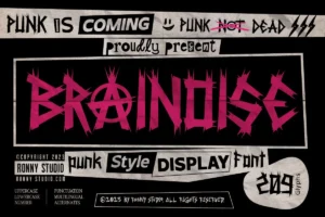
Brainoise is a bold punk display font with jagged and irregular letterforms.
Its raw visual character makes it suitable for band logos, album covers, posters, merchandise, and rebellious branding.
Best for: Punk, alternative rock, underground bands.

Centive takes a completely different direction.
Its bold futuristic sans-serif construction works well for modern music identities, album covers, posters, apparel, and experimental branding.
Best for: Electronic, futuristic, experimental, modern bands.

For darker and more extreme visual identities, Disgored can create a dramatic appearance.
Its aggressive blackletter-inspired aesthetic is particularly suitable for heavy music artwork and underground merchandise.
Best for: Metal, hardcore, dark music.

Swinger brings an aggressive hardcore aesthetic to the typography.
Its sharp and dramatic forms can work particularly well for band logos, album artwork, posters, and merchandise.
Best for: Hardcore, extreme music, underground bands.

Greedy Loading uses a bold display approach that can work extremely well when the band’s name needs to dominate the design.
Its large visual presence makes it suitable for posters, merchandise, album artwork, and statement-driven music graphics.
Best for: Rock, alternative, street music, merchandise.
Use your music genre as the starting point.
Try:
Blackletter + death metal + sharp display
Try:
Hardcore + distorted + bold display
Try:
Punk + graffiti + distressed typography
Try:
Bold display + brush + vintage
Try:
Experimental + futuristic + unconventional display
The most important thing is consistency.
Your logo should work together with your album artwork, merchandise, social media graphics, posters, and website.
A complicated logo isn’t automatically a better logo.
Make sure the band’s name remains recognizable.
Try combinations such as:
Black + white
Dark background + light typography
Bold type + thin supporting text
Contrast makes the logo easier to recognize.
Don’t always place the band name in a straight horizontal line.
Try:
Typography itself can become part of the artwork.
Sometimes you don’t need an icon.
A unique typographic treatment can become the band’s entire visual identity.
If you’re designing a band logo, album cover, merchandise, or music poster, explore the Ronny Studio font collection.
Ronny Studio focuses heavily on expressive display typography, including punk, metal, gothic, graffiti, futuristic, brush, and experimental styles.
The collection includes typefaces designed for applications such as logos, album artwork, posters, apparel, merchandise, and branding.
Choosing the best font for a band logo depends on the personality and genre of the music.
A death metal band may need something dark and chaotic.
A hardcore band may need something aggressive and powerful.
A punk band may benefit from rough and rebellious typography.
Meanwhile, an experimental music project may look better with futuristic or unconventional lettering.
The right typeface can become one of the most recognizable parts of a band’s identity.
Explore Ronny Studio fonts and find the typeface for your next band logo, album cover, or merchandise design.