**Premium Fonts for Logos, Posters, Branding & More — Start Creating.**
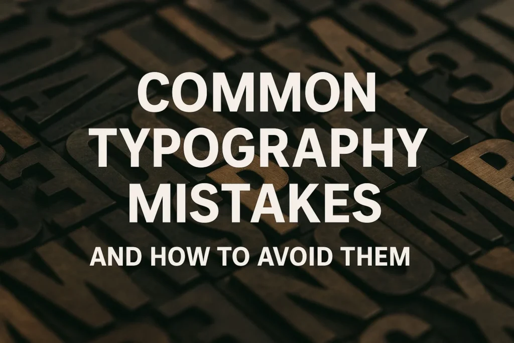
Typography isn’t just about picking a pretty font; it’s about balance, structure, and rhythm.
You can have stunning colors, perfect images, and killer composition—but if your typography is off, everything feels wrong.
At Ronny Studio, we’ve seen hundreds of projects where minor typographic errors destroyed an otherwise solid concept. Below are the three most damaging typography mistakes and practical ways to fix them.
A common beginner error is using too many typefaces within one layout. You’ve seen it: script titles, bold sans-serif subtitles, serif paragraphs, and a handwritten quote all on the same poster.
The result? Visual noise.
Each typeface carries its own tone and rhythm. When you combine several unrelated ones, the viewer’s eye jumps everywhere and the message becomes confusing.
Stick to two typefaces:
A display font for headlines or your logo (something expressive like Thiskuy or Dawnee).
A supporting sans or serif for body copy or smaller text.
If you need contrast, vary the weight and style (Bold, Light, Italic) rather than changing the font family.
Professional designers build a consistent “type system” that feels like a unified brand voice.
Create a quick type-pairing sheet for every project. Test your headline and paragraph side by side. If they argue instead of harmonize, start over.
You might have the perfect font, but if your spacing is inconsistent, it will still look amateur.
Letters too close together look cramped; too far apart feels disconnected. Uneven line spacing makes paragraphs hard to read.
Learn to master three spacing controls:
Kerning – adjust the space between specific letter pairs (like “A V”).
Tracking – controls the overall letter spacing in a block of text.
Leading – the vertical space between lines.
Proper kerning turns “WA” from awkward to elegant. Good tracking helps logos breathe. Balanced leading guides the reader’s eye smoothly down the page.
Look at Thrashlane — the brush strokes are aggressive, but the kerning is meticulously balanced so the chaos still feels controlled.
That’s intentional design: wild energy, but readable energy.
Type your logo text twice — one with default spacing, one adjusted manually.
Zoom out to 25%. Which one reads cleaner? You’ll instantly see the difference.
You design a dark-gray caption on a slightly darker background because it looks “aesthetic.” Then nobody can read it.
Low contrast is one of the fastest ways to ruin typography. It’s not just about visibility; it’s about hierarchy and focus.
Ensure sufficient contrast between text and background. Use tools like Contrast Checker to test accessibility.
Beyond color, think about font weight and size — small, thin fonts on bright screens often disappear.
Consider these general guidelines:
Light background → darker font color (charcoal, black).
Dark background → lighter font color (white, pale tones).
Texture background → apply a subtle shadow or overlay behind text.
Contrast isn’t only technical — it’s emotional.
Warm colors (orange, red) project energy and confidence, perfect for fonts like Crazy Blocks.
Cool colors (blue, gray) feel calm and trustworthy, great for minimal or corporate designs.
Typography hierarchy tells readers where to look first. Without it, all text feels the same weight, and your design loses flow.
Use scale, weight, and color to build layers:
Headlines: Large size + bold font (e.g., Dawnee Bold)
Sub-headlines: Medium weight or different color tone
Body text: Regular weight, generous leading
Captions / notes: Smaller size, lighter gray
You don’t need to over-style — just make sure your viewer’s eyes move naturally from title to content.
Every typeface has a backstory. When designers use fonts randomly, they risk sending mixed signals.
Imagine using a gothic blackletter font for a minimalist skincare brand — visual dissonance.
Research font origins and meanings before applying them.
If your project connects to underground music or streetwear, fonts like Dawnee or Overals amplify authenticity.
If it’s a tech start-up or modern café, stick with geometric sans-serifs or experimental display fonts that suggest innovation.
When your typography fails, your message fails. But the reverse is also true: perfect typography can make even a simple layout feel premium.
Here’s a quick recap:
| Mistake | Fix |
|---|---|
| Too many fonts | Limit to 1–2 families |
| Bad spacing | Master kerning, tracking, leading |
| Low contrast | Increase visibility, test colors |
| Weak hierarchy | Use scale and weight variation |
| Random fonts | Match typeface to brand emotion |
Typography mastery is about discipline and empathy — caring about how your audience reads and feels your design.
Typography is invisible when done right, and distracting when done wrong.
Every successful design, from a metal album cover to a minimalist brand logo, depends on how letters breathe together.
At Ronny Studio, we design fonts that already solve many of these issues — handcrafted spacing, consistent rhythm, and purpose-driven emotion.
Whether you need the bold rebellion of Thrashlane or the playful balance of Thiskuy, our library gives you a head start toward flawless typography.
CTA:
👉 Explore fonts crafted for clarity and character → ronnystudio.com/fonts